
Enovational’s lack of investor reporting features had become a make-or-break gap with a major potential client. I worked with SME’s, Product, and Engineering to define requirements and design the core experience as well as our first dashboard and data visualization patterns.
After a one-week sprint, we had demo-ready features that helped close our first major client while establishing reusable patterns used across the product today.
Enovational set out to modernize a multi-trillion-dollar segment of the fintech industry by unifing dozens of fragmented legacy tools into one modern platform.
This case study is white-labeled. Many details and mockups have been altered to protect confidential information while preserving the accuracy of my role, process, and impact.
As one of the first designers on the project, I established the foundations of the product experience and its design system. I created scalable patterns, architected end-to-end workflows, and produced the documentation that allowed design and engineering teams to deliver consistently across a rapidly growing platform.
This case study focuses on my work designing the Investor Management features and how those solutions shaped the product’s workflows, data visualizations, and navigation structure.
After several years of development, our product had hundreds of features, but without Investor Management, many potential customers told us to come back to them when it was done. My job was to get this critical section of our application demo ready, fast.
My design process, and this case study, follows a repeatable order of operations: Valuable > Usable > Practical > Presentable. This framework helps me and my teams solve design problems in the right order to efficiently design scalable solutions for any enterprise application.
Enterprise Fintech
MVP
UX Designer, Product Manager, Business Analyst, Tech Lead, Front End Developer

Great UX starts with understanding the value my users and customers need from my product. Delivering this value becomes the basis for every design decision I make.
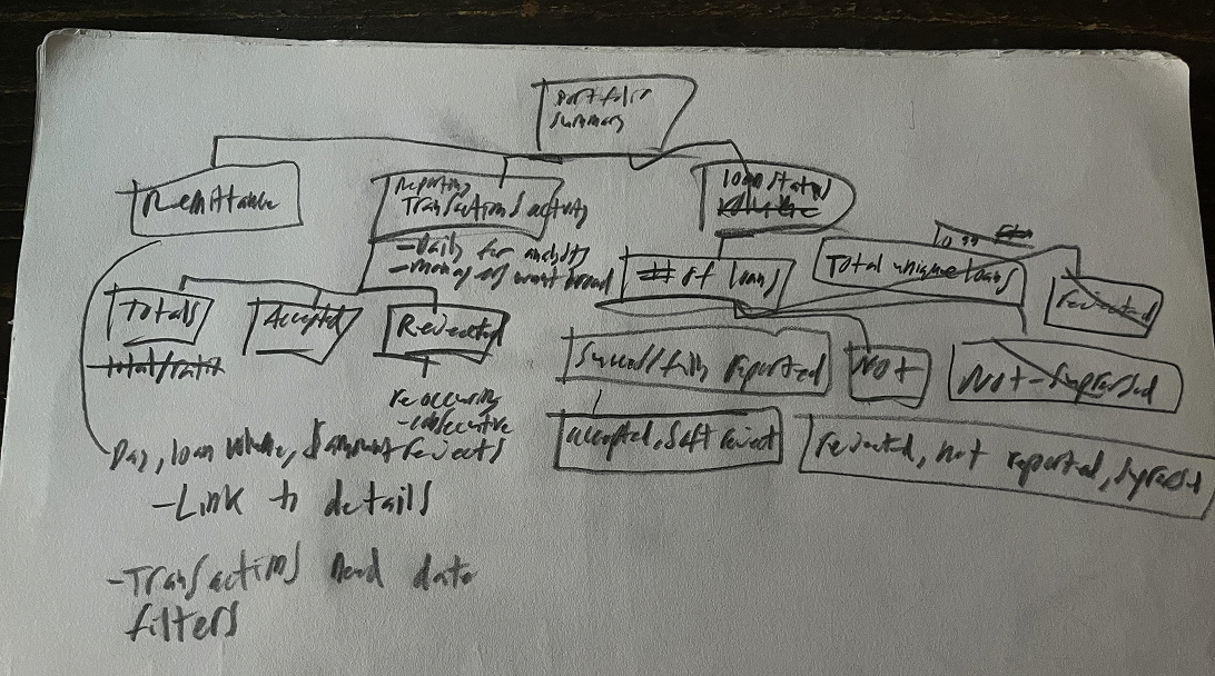
Value comes first. I started this project with my SME and a sheet of paper to map the core value Investor Management users needed from the product.
I use a technique from "The Pyramid Principle" that begins by identifying a single unifying outcome that all my design work will ladder up to. This outcome becomes the backbone of the information architecture and the optimal user flow.
Reporting, Remittance, and Reconciliation were the core outcomes for Investor Management users.
At a fundamental level, investors needed to understand what was happening with their money, receive the funds they were owed, and resolve any discrepancies between their records and our systems. These outcomes would go on to shape every workflow and visualization I designed.
This case study will focus on just one of the many 'Reporting' features I designed to help users the status and progress of their investor reporting.
In complex industries, my SMEs understand our users and domain better than I ever could. My role is to translate that expertise into experiences by asking the right questions, structuring their insights, and applying design principles so we can make user-centered decisions together.
I define the critical weaknesses in my users existing workflow so I can elevate their experience to make my product superior to anything else on the market.
In this case, Investor Reporters required extensive training just to process basic monthly data reports. The existing process was highly inefficient and far too time-consuming to scale.
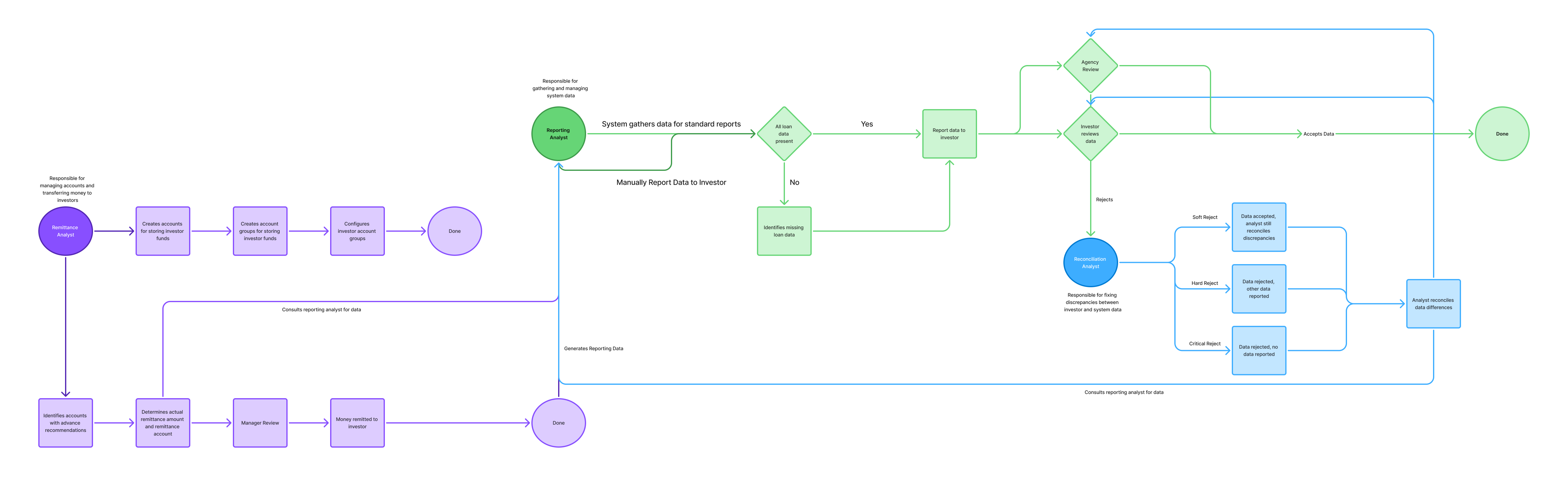
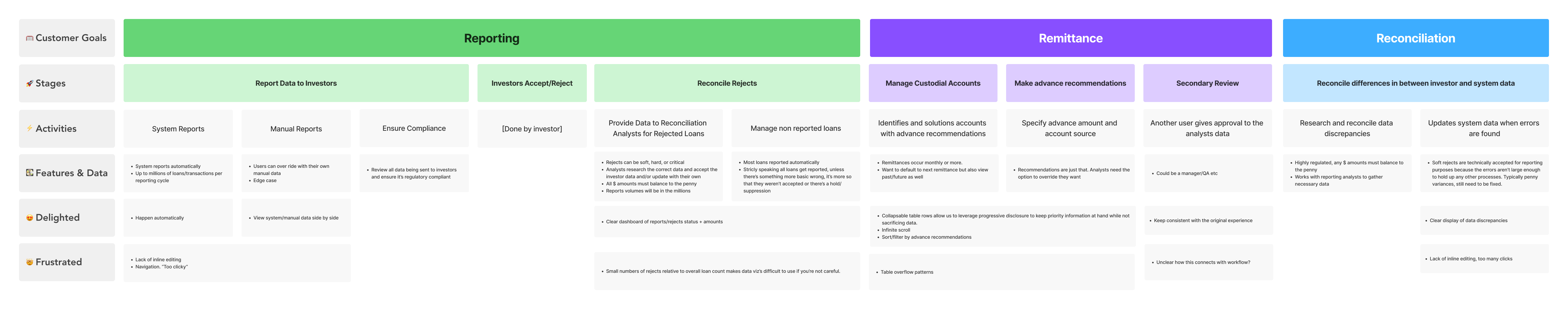
Investor Management is about managing huge amounts of money, and regulations require each amount be balance to the penny.
In highly regulated industries, it's often not enough to just understand broad outcomes; I need to know the must-have requirements for any solution.
To uncover these requirements, I work with my SME's to dig below the surface of the workflow to understand the underlying business rules, edge cases, and constraints that must shape the design from the start.

Products only provide value if people know how to use them. By understanding my users I can design how to deliver that value in an intuitive way. This usually requires me to identify all the obastcles between a user and their goal and remove them through design.
Once I understand a specific user problem, I define it in a generic way so my solution can be scaled out to the rest of the application whenever that same generic problems appears.
In Investor Managements case, the primary new generic problem I identified was data visualization, how users would view and compare high quantities of data.
I design the experience first, then determine the components needed to deliver it. For Investor data visualizations, I needed a pattern that could intuitively show users their progress across large workloads, while still surfacing small but critical exceptions requiring their attention.

Users shouldn’t have to dig for vital work information. The system already had a Workflow feature that acted as a home screen, but in practice it functioned more like a simple task queue. I reimagined it as a full custom workstation that put all a users needed info in one place.

Businesses don’t hire designers to make things look nice in Figma, they hire them to shape the intent for developers to translate to code. My solutions need to deliver customer value while being feasible for my developers to implement.
Once I understand my generic use cases I can start on the solution. I like to share my designs early and often to get everyones feedback. I see it as a form of evaluative research to test if I'm going in the right direction. A favorite expression of mine is "Don't go for 'wow'... go for 'of course!".
Our product didn't have any data visualization patterns yet, but investor reporters were going to need a quick readout on their situation for the day. I leveraged D3, a commonly used data visualization library, to allow our engineering team to quickly develop the components we needed, starting with a donut chart.
Designing with real data is critical to creating practical enterprise solutions. Investor reporters simultantiously work data numbering in the millions and the hundreds. I couldn't just put both data types in the same chart, else the smaller quantities would be drawfed by the larger ones and rendered irrelevant.


I partnered with engineering to develop detailed documentation for our visualization patterns. This included usage guidelines and example edge cases to eliminate ambiguity and create a shared language across design, engineering, and product so our components could scale predictably as the platform grew.

Aesthetics come last because people typically don’t pay to see shiny buttons and cool color gradients, but products need to look professional or people won’t take them seriously.
For data visualizations to be as intuitive as possible I often need to add semantic meaning to the colors. Green is good, red is bad, and everything in between to allow users to instantly understand the state of their data.
Originally, one of our donut charts showed only reject categories to highlight work that remained. But this approach unintentionally created an incomplete story. If a user had corrected all their rejects, the visualization would be empty.
Rather than visualizing that no work remained, I changed it to show how much work had been completed, creating a more satisfying and accurate experience for the user.

